We+Worksoft
They didn't hire an agency. They hired a design department.
The situation
Worksoft builds test automation for the world's largest SAP ecosystems. In 2025 they were repositioning for the AI era with a brand that hadn't been touched since 2021, and a website that had grown hard to navigate.
They didn't need a one-off rebrand. They needed a partner to build the system and then run it: every booth, deck, ebook, ad and page, designed by one team through one monthly plan.
One brand system. Everywhere it had to hold up.
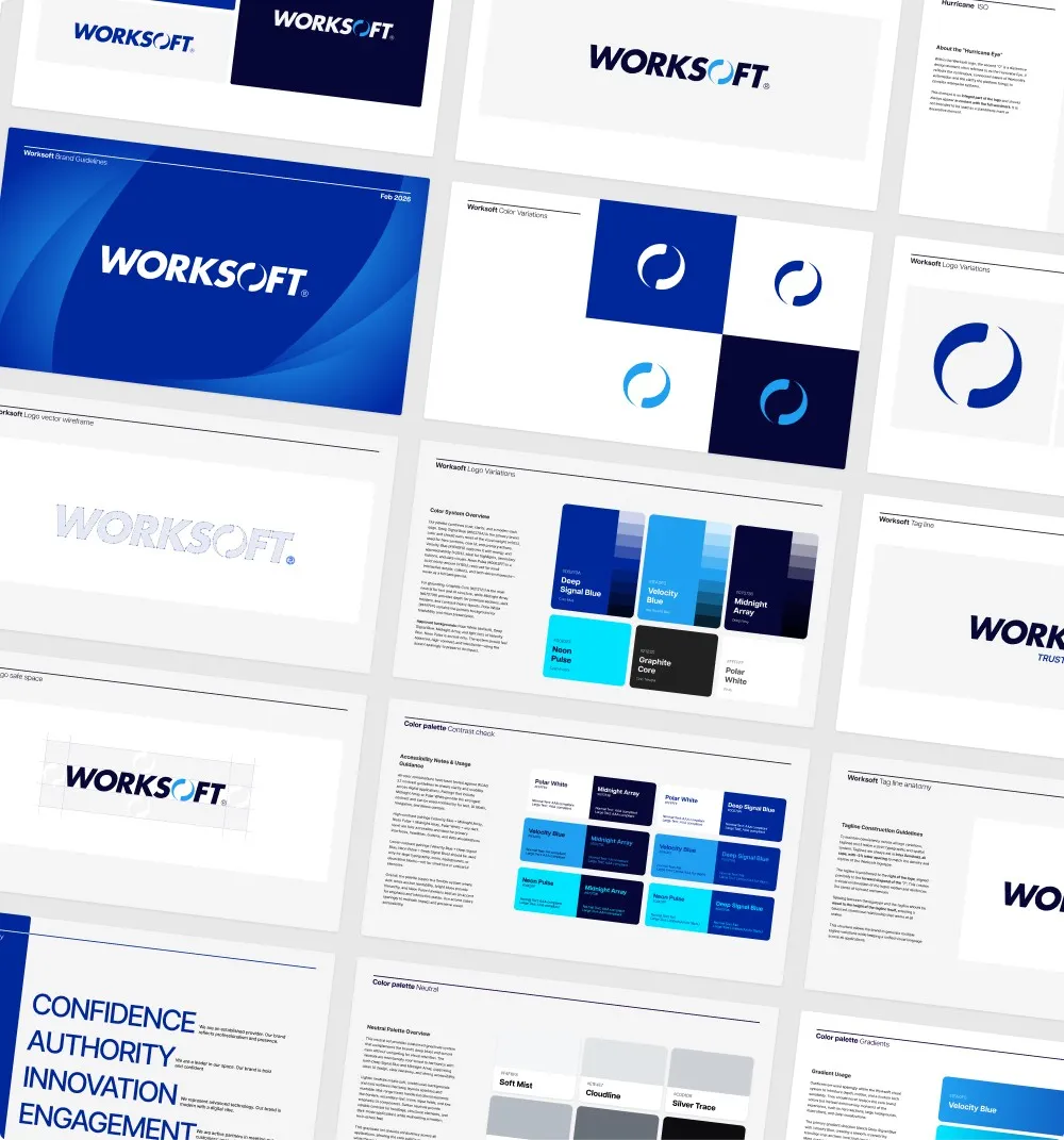
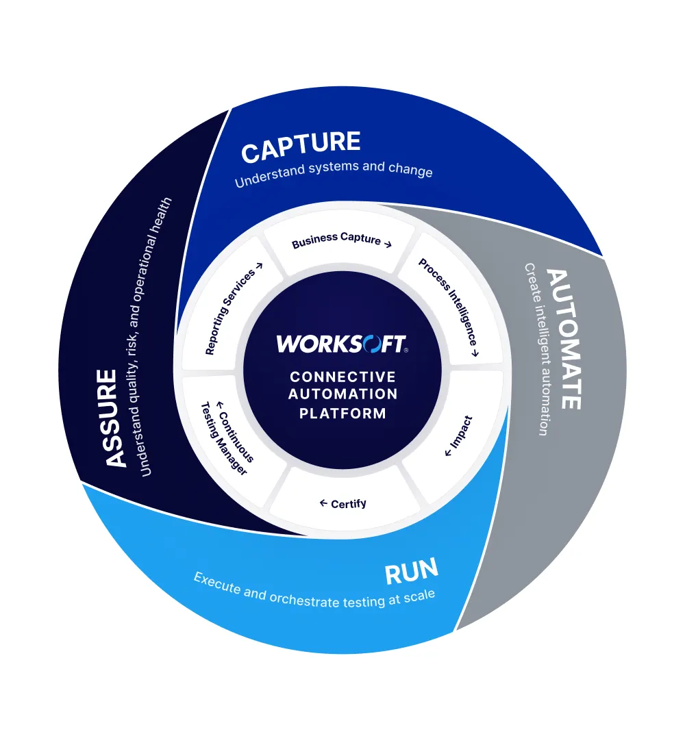
We rebuilt the brand as a system, not a logo refresh: color, type, icons, the Hurricane Eye mark and tagline rules, documented in more than 50 pages of guidelines with accessibility checks on every color pairing.
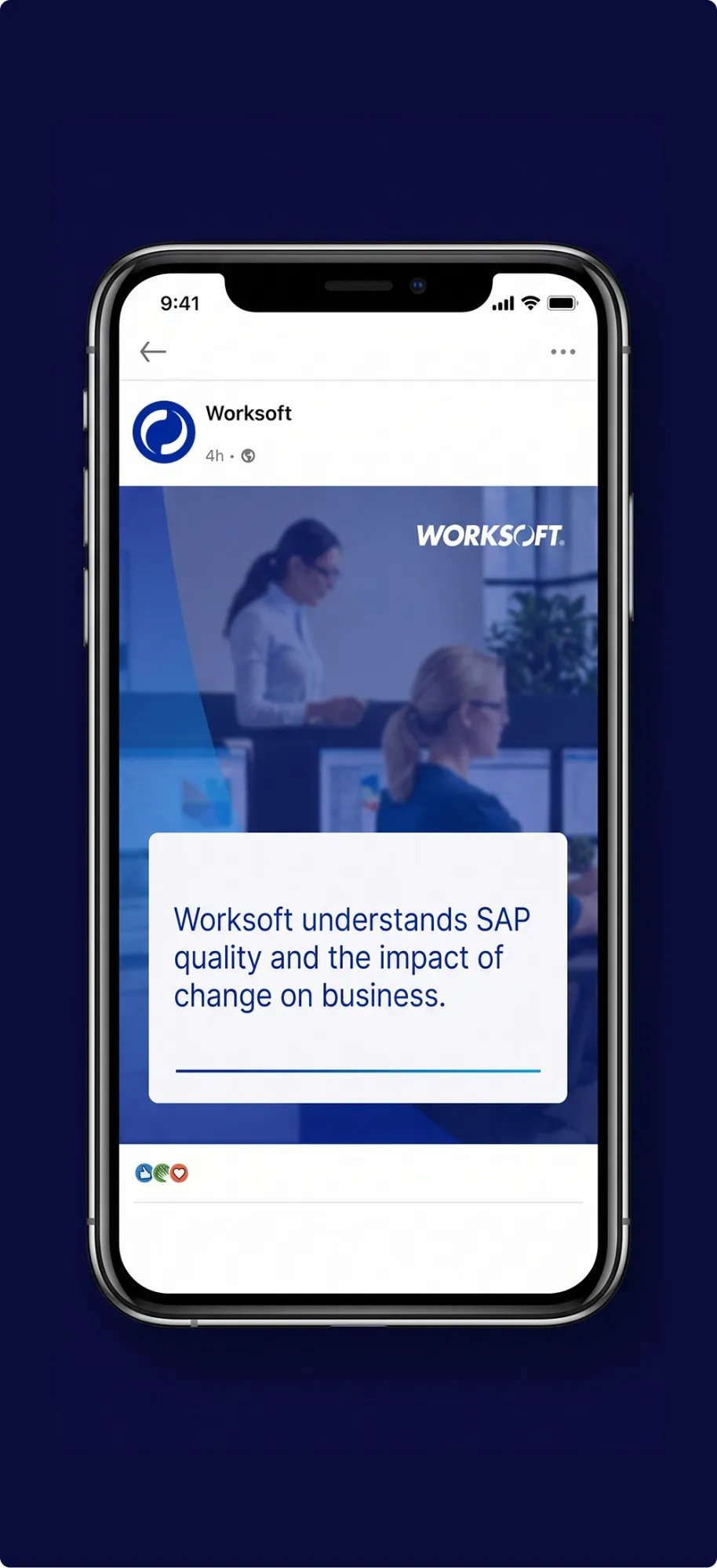
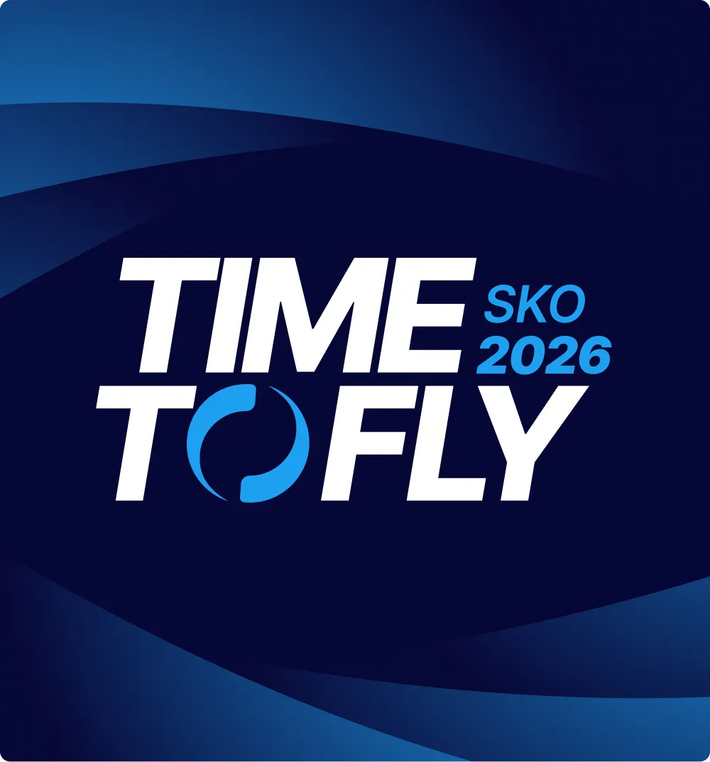
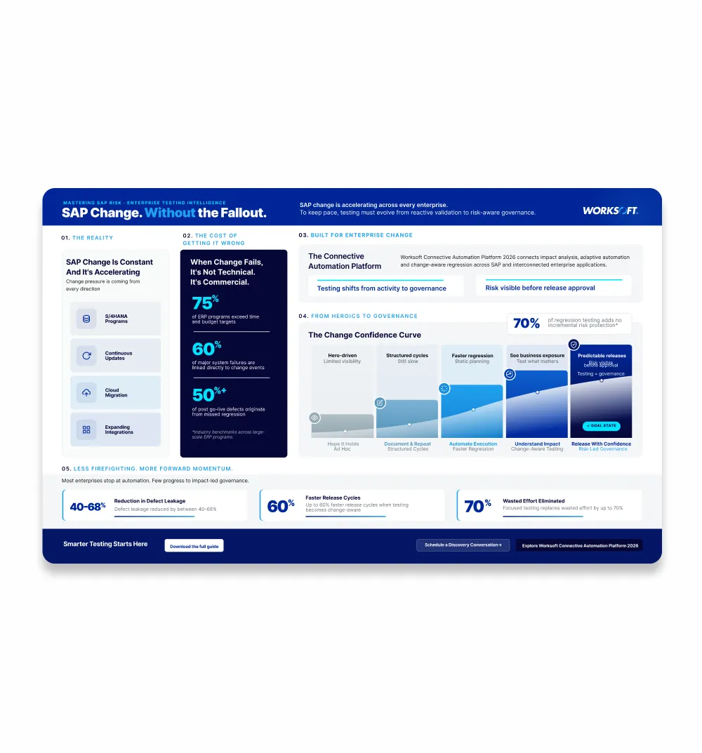
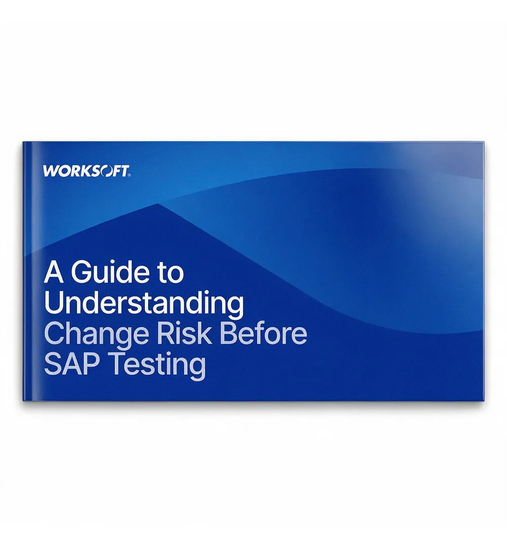
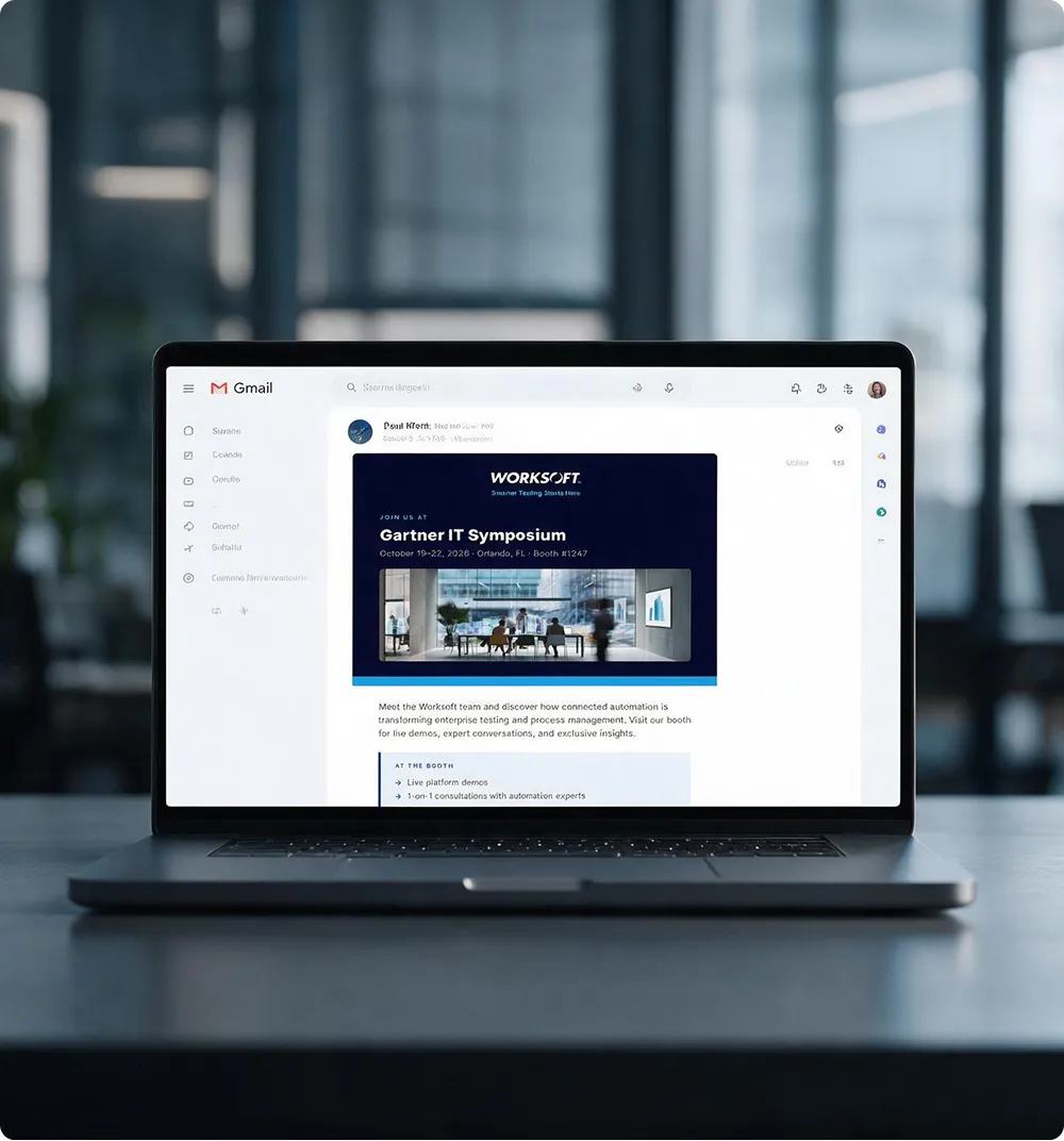
Then we ran it. Sub-brands, PowerPoint masters, ebooks, email systems, event graphics, office walls, even the mascot for Worksoft's AI assistant. When one team designs everything, everything matches.
Pages of brand guidelines
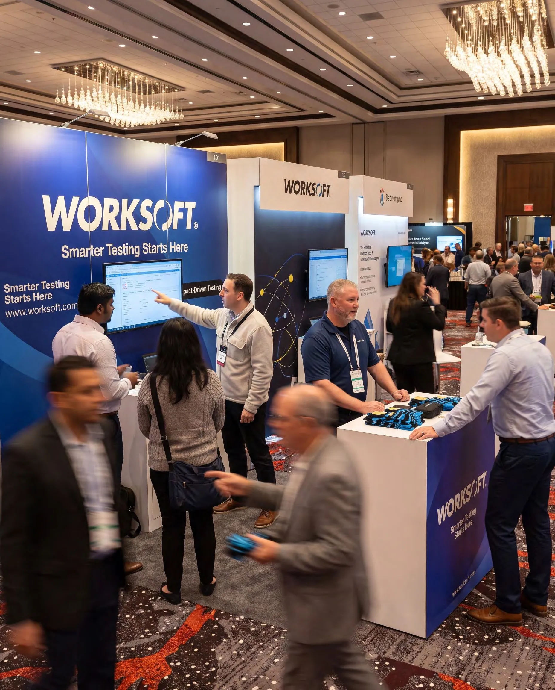
Trade show booths
Deck systems
Paid ad creatives
It started as a facelift. We treated it like a flagship.
The brief was a visual refresh of worksoft.com. But a new coat of paint on a confusing site is money wasted. So we ran it like a web consultancy, inside the same monthly plan: audit first, strategy second, pixels last.
Worksoft's developers are building the new site in WordPress. We handed off the components and stayed on for design review and QA, so what launches is what was designed.
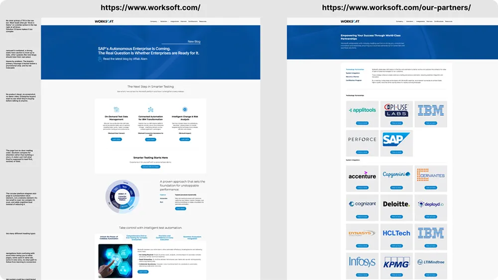
Map before touching
Every page of the current site mapped and annotated, plus a structured discovery on goals and conversion priorities.
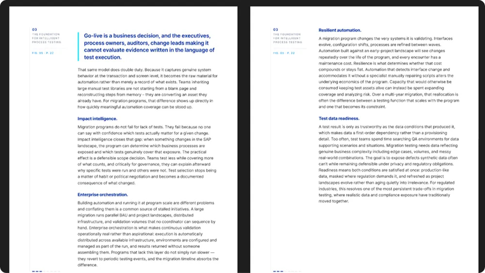
Know who it's for
Marketing analysis distilled into three target personas and conversion recommendations the team actually uses.
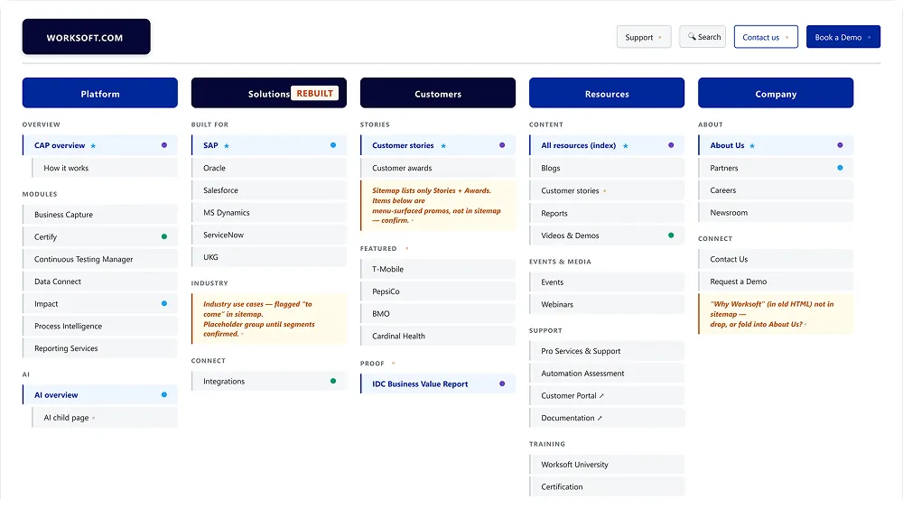
A leaner sitemap
Our recommendation removed 9 pages and an entire mega menu. Simpler to navigate, cheaper to maintain.
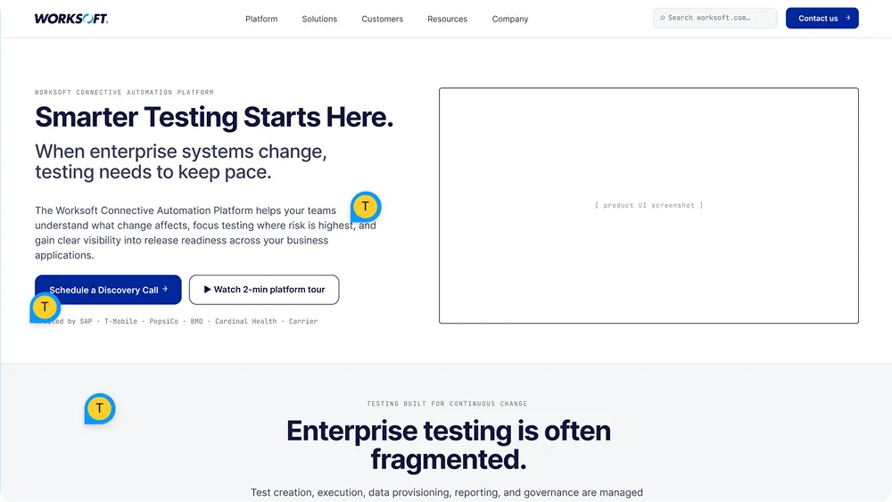
Decisions before pixels
Every template wireframed with real draft copy and locked in weekly working sessions before visual design began.
Ready for the dev team
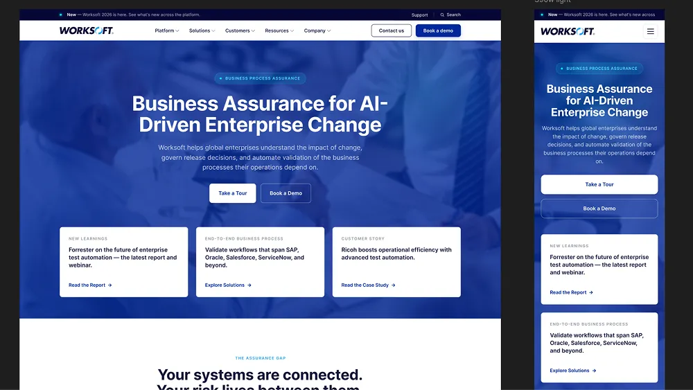
Around 20 templates in high fidelity, desktop and mobile, with a design system, icons, image specs, component handoff and QA.
The result
A year in, Worksoft has one design partner instead of a stack of vendors. Every request is sized and queued on one shared board, and every sprint closes with a written update, a Figma link and a video walkthrough. Twelve months, zero silent weeks.
The website followed the same way. Our sitemap cut 9 pages and an entire mega menu, and around 20 templates went to the dev team ready to build, with the design system, icons and image specs behind them.
Requests through one board
Approved and shipped
Pages cut from the sitemap
Templates, desktop and mobile
“We compared it to hiring in house and to our old agency, and this wins on every front. No scoping calls, no retainers, no overhead. The output easily justifies the subscription.”