We+Callan Pharma
A precision-built identity for a new era of pharmaceutical innovation.
The situation
Callan Pharma needed a distinct, modern brand system that could convey scientific rigor, trust and innovation.
The goal was more than a logo: an identity that scales across digital and print, lab environments and regulatory communications.
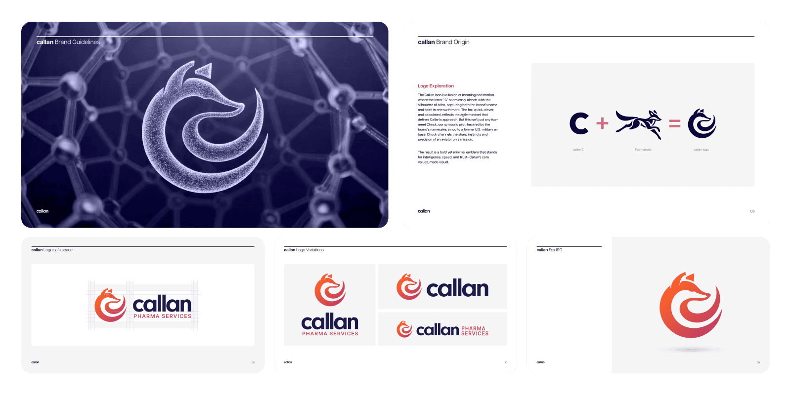
Precision + agility, drawn as a fox
We built the brand around one idea: precision + agility. The fox became the reference point: clever, calculated and adaptable. Every decision, from geometry to motion, reinforces where Callan sits, at the intersection of science and innovation.
The mark combines the letter C with a stylized fox silhouette. It's built from strict geometry, so it stays bold and clear everywhere, from a vial label to a lab coat to a LinkedIn avatar.
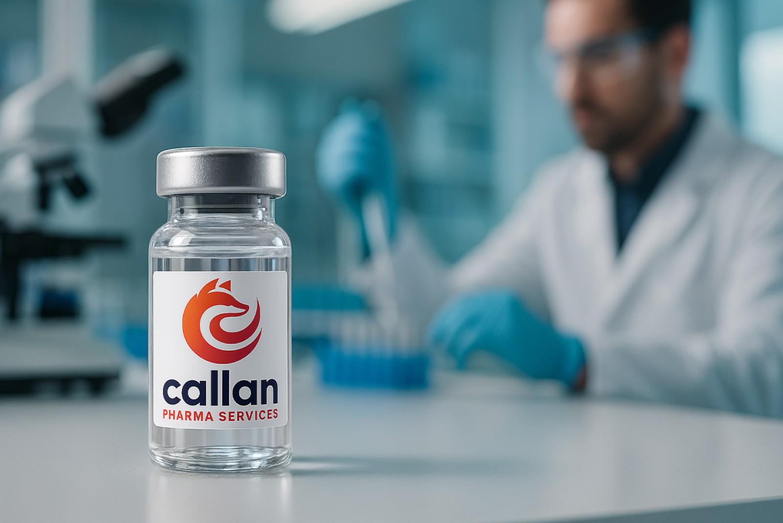
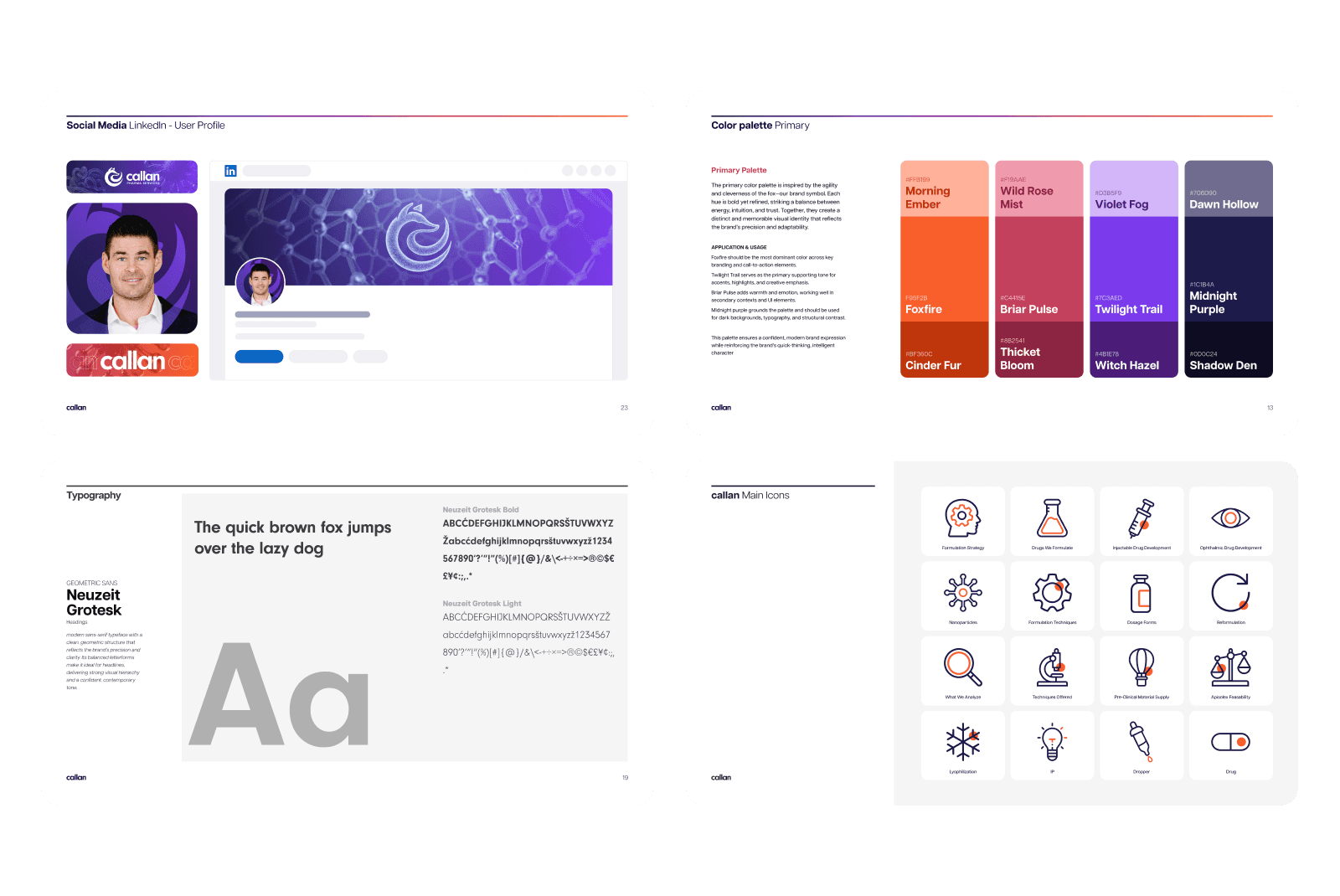
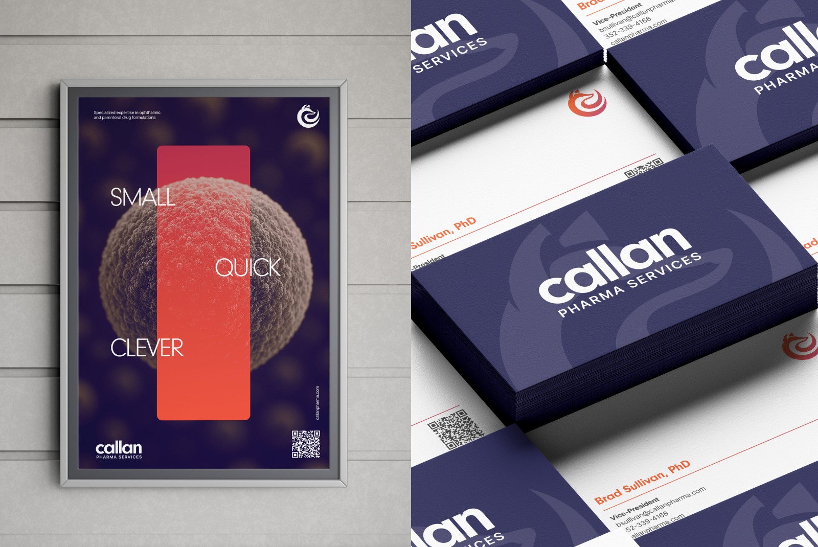
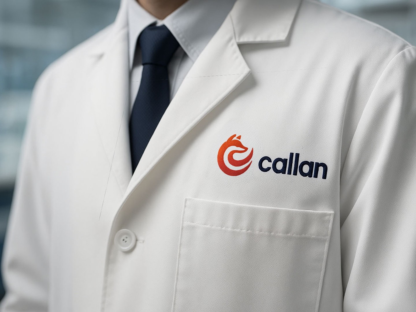
One system, from the lab to social media
The palette is anchored by Foxfire, a vibrant orange for energy and forward momentum, paired with Midnight Purple for depth and stability. Neutrals and gradients handle contrast across every format. Neuzeit Grotesk, a geometric sans serif, carries the headlines; Inter keeps digital text legible.
The guidelines cover stationery, signage, digital layouts, icons, environmental graphics and lab materials, so every touchpoint comes from the same visual system.
Precision + agility
A brand idea borrowed from the fox: clever, calculated, adaptable.
The C and the fox
One mark, built from strict geometry for recognition at any size.
Foxfire + Midnight Purple
Orange for momentum, purple for stability, neutrals for contrast.
Neuzeit Grotesk + Inter
A confident geometric sans for headlines, Inter for screens.
Every touchpoint
Stationery, signage, social, icons and lab materials.
The result
Callan's identity is both definitive and adaptable. The system gives internal teams structure while leaving room for creative expression.
Every expression, from a social post to a sample vial, reinforces Callan's role as a trusted, agile leader in pharmaceuticals.